
Geospatial and Density Analysis with Heat Maps and Field Maps in Power BI
Jul 17, 2024
Geospatial and Density Analysis with Heat Maps and Field
Maps in Power BI.
In today's blog post, I’ll explore how to
create and utilize Heat Maps and Field Maps in Power BI to visualize complex
data patterns and geographical information.
Introduction
Heat Maps are an excellent tool for
representing data density, showing how values are distributed across a dataset
using color gradients. They help in identifying hotspots and trends in large
datasets quickly. On the other hand, Field Maps enable users to plot data
geographically, offering a spatial context to the information. This
visualization is crucial for analyzing regional sales, market trends, and other
geographically dependent metrics.
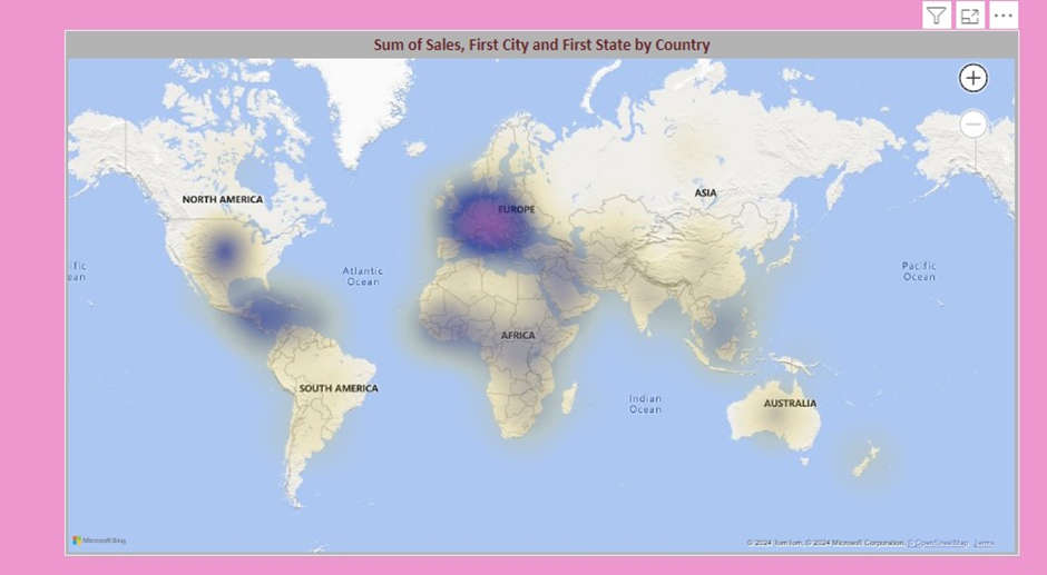
Heat
Map in Power BI
A heat map is a data visualization technique
that shows the magnitude of a phenomenon as color in two dimensions. It can
help identify trends and patterns in your data. Here’s how to create a heat map
in Power BI:
Step
1: Load Your Data
- Open
Power BI Desktop.
- Click
on Home > Get Data to import your dataset.
- Select
your data source (e.g., Excel, SQL Server) and load your data into Power
BI.
Step
2: Create a Heat Map
- From
the Visualizations pane, select the Matrix visual.
- Drag
the fields you want to visualize to the Rows and Columns buckets.
- Drag
a measure (e.g., sales, counts) to the Values bucket.
- To
convert the matrix to a heat map, go to the Format pane.
- Expand
the Conditional Formatting section.
- Turn
on Background Color and set the color scale as desired.
Example
of Heat Map
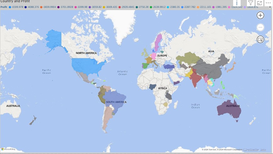
Filled
Map in Power BI
A filled map (also known as a choropleth
map) uses shading to show data across geographical areas. This is useful for
comparing regions or states.
Step
1: Load Your Data
- Open
Power BI Desktop.
- Click
on Home > Get Data to import your dataset.
- Select
your data source and load your data into Power BI.
Step
2: Create a Filled Map
- From
the Visualizations pane, select the Filled Map visual.
- Drag
a geographical field (e.g., country, state, city) to the Location bucket.
- Drag
a measure (e.g., population, sales) to the Values bucket.
- Power
BI will automatically create a filled map, shading the regions based on
your measure.
Step
3: Customize the Filled Map
- Go
to the Format pane.
- Expand
the Data Colors section to adjust the color gradient.
- Expand
the Map Settings section to adjust the map style, zoom level, and other
settings.
Example
of Filled Map
Best
Practices
- Ensure
your data has accurate geographical information for filled maps.
- Use
colour gradients effectively to convey information without overwhelming
the viewer.
- Combine
heat maps and filled maps with other visuals to provide a comprehensive
view of your data.
Conclusion
Heat maps and filled maps in Power BI are
powerful tools for visualizing complex data patterns and geographical
information. By following these steps, you can create compelling and
informative visualizations that highlight key insights in your data.
For more detailed guidance and in-depth training, visit our training here.
Share:

