Effective Trend Analysis with Line Charts in Power BI.
Jul 17, 2024
Effective Trend Analysis with Line Charts in Power BI.
In today’s blog post, I’ll Walk you through
the process of creating a Line Chart in Power BI, allowing you to effectively
visualize trends over time and conduct detailed comparative analysis for
deeper insights.
Creating a line chart in Power BI is a
straightforward process that helps visualize trends over time. Follow these
steps to create a line chart in Power BI:
Step
1: Load Your Data
- Open
Power BI Desktop.
- Click
on "Get Data" from the Home ribbon.
- Select
your data source (e.g., Excel, SQL Server, etc.), and load the data into
Power BI.
Step
2: Select the Line Chart Visual
- In
the "Visualizations" pane, click on the line chart icon. This
will add a blank line chart to your report canvas.
Step
3: Add Data to the Line Chart
- Drag
the field that represents the time dimension (e.g., Date, Month) to
the Axis field well.
- Drag
the field that represents the value you want to plot over time
(e.g., Sales, Revenue) to the Values field well.
Step
4: Customize the Line Chart
- Title:
Click on the line chart to select it, then go to the "Format"
pane (paint roller icon). Expand the "Title" section and turn it
on. You can customize the title text, font, size, and color.
- Axes:
In the "Format" pane, expand the "XAxis" and
"YAxis" sections to customize the axis titles, scale, and
gridlines.
- Data
Colors: If you have multiple lines, you
can change the colors of each line by expanding the "Data
colors" section in the "Format" pane.
- Legend:
If you have multiple categories, you can customize the legend by expanding
the "Legend" section in the "Format" pane.
Step
5: Add Analytics (Optional)
- Click
on the line chart to select it, then go to the "Analytics" pane
(magnifying glass icon).
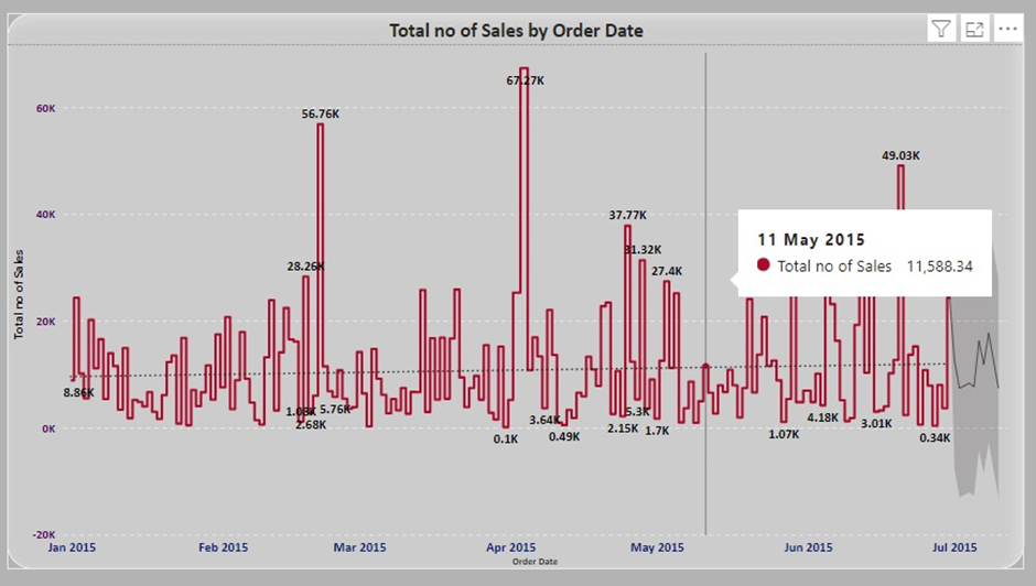
- You
can add various analytics features such as constant lines, trend lines,
and average lines to enhance your chart.
Step
6: Interact with the Line Chart
- Power
BI allows for interactive features. You can click on data points to filter
other visuals in your report.
- Use
slicers and filters to further explore the data represented in the line
chart.
Example
Scenario
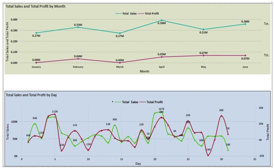
Suppose you have a dataset containing
monthly sales data. Here's how you can visualize this data using a line chart:
- Axis:
Month
- Values:
Sales
This will produce a line chart showing sales
trends over the months, helping you identify patterns, trends, and potential
anomalies in your sales data.


Conclusion
Creating a line chart in Power BI is a
powerful way to visualize trends over time, helping you gain insights from your
data. By following these steps, you can create and customize a line chart to
suit your reporting needs.
For more detailed guidance and in-depth training, visit our training here.

